design is behind it all

o ahead and give it a try. Tuning into music in your car. Watching commercials on TV. Doing your weekly grocery shopping, either in the store or online. Taking in player statistics while watching the game. Look around…You simply can’t escape graphic design.
When we hear the term “graphic design,” most of us think of posters, packages and promotional mailers. While graphic design plays a major role in those applications, it can also be found virtually everywhere else.
Have you ever noticed that tiny “Inspected by 47” slip of paper in the pocket of your new jeans? Or the “Don’t Remove Under Penalty of Law” tag on your mattress? If you’re like most, you probably haven’t ever thought about who creates the labels and control buttons on your smart thermostat or the water and ice icons on your refrigerator. All of these have been touched, imagined and created by a graphic designer.
Before a product is ever seen by a consumer on the shelf, many end-user variables are taken into consideration by a graphic designer.
Take a set of instructions for example. You buy a product, open up the box and it comes with 15 different pieces. The assembly instructions included in the box have to be specially designed to accommodate someone who has built one of these 100 times and someone who has rarely picked up a screwdriver. They have to be intuitive, clear and easy to read. Illustrations, font, layout and legibility are all well-thought-out by a graphic designer.
Here’s something else fascinating about graphic design: the best design work is the work you don’t notice. That’s because good graphic design results in good balance. Everything just feels right.
Take fonts for example, the trickiest of all design components.
In the best graphic designs, the type is the right size, weight and shape. It’s placed perfectly and reads clearly. Most people look past fonts – consciously – but our subconscious mind is very aware of them. Type that’s too big or too small, positioned too close or too far from the edge, the wrong style, weight or color: any of these tend to make us feel uneasy. We can’t always readily identify why, but there’s something just not right.
Alignment is another critical component of good graphic design. We don’t actually see it, but layouts are designed on an invisible grid of perfect vertical and horizontal lines that our brains innately process. And for things to “feel right”, design elements must be aligned on that grid. Even if things are off just a little bit, it could mean the design just doesn’t sit right with us. Almost like if a bathroom tile was just slightly misaligned in your shower. It may just drive you crazy.
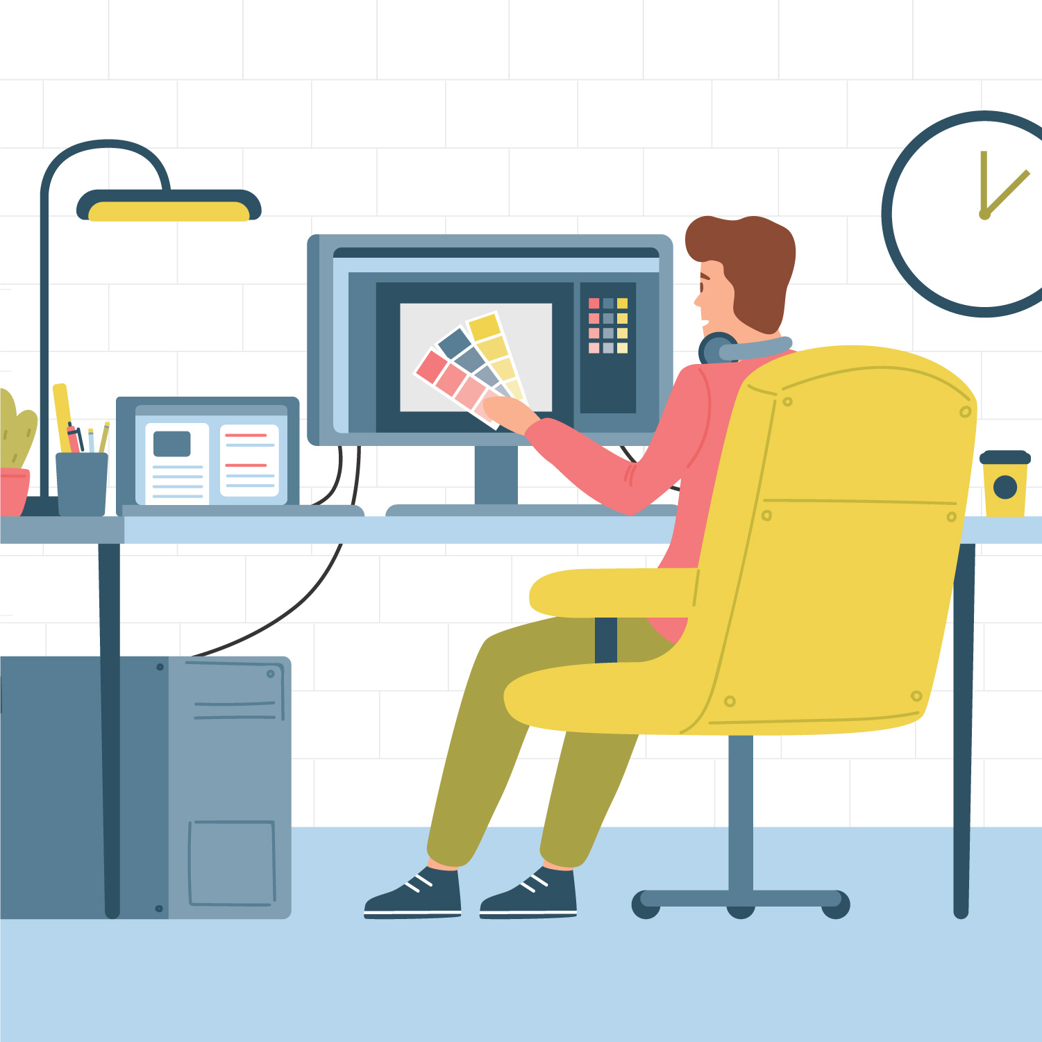
The best professional graphic designers find joy in every layout they create, from the smallest label to the most elaborate catalog. They understand that they’re adding the visual element to the story and that their work can either enhance or hinder the clarity of the message. Colors, photos, illustrations and unique art elements are all created and brought together by graphic designers, whose eyes are trained to know what works – and what doesn’t – in order to help a message come to life.


